文档常见问题
为什么H5会话页面有遮挡折叠?
有时会有访客反馈说手机网页打开对话页面遮挡,导致他无法回复客服的消息,这是为什么呢?
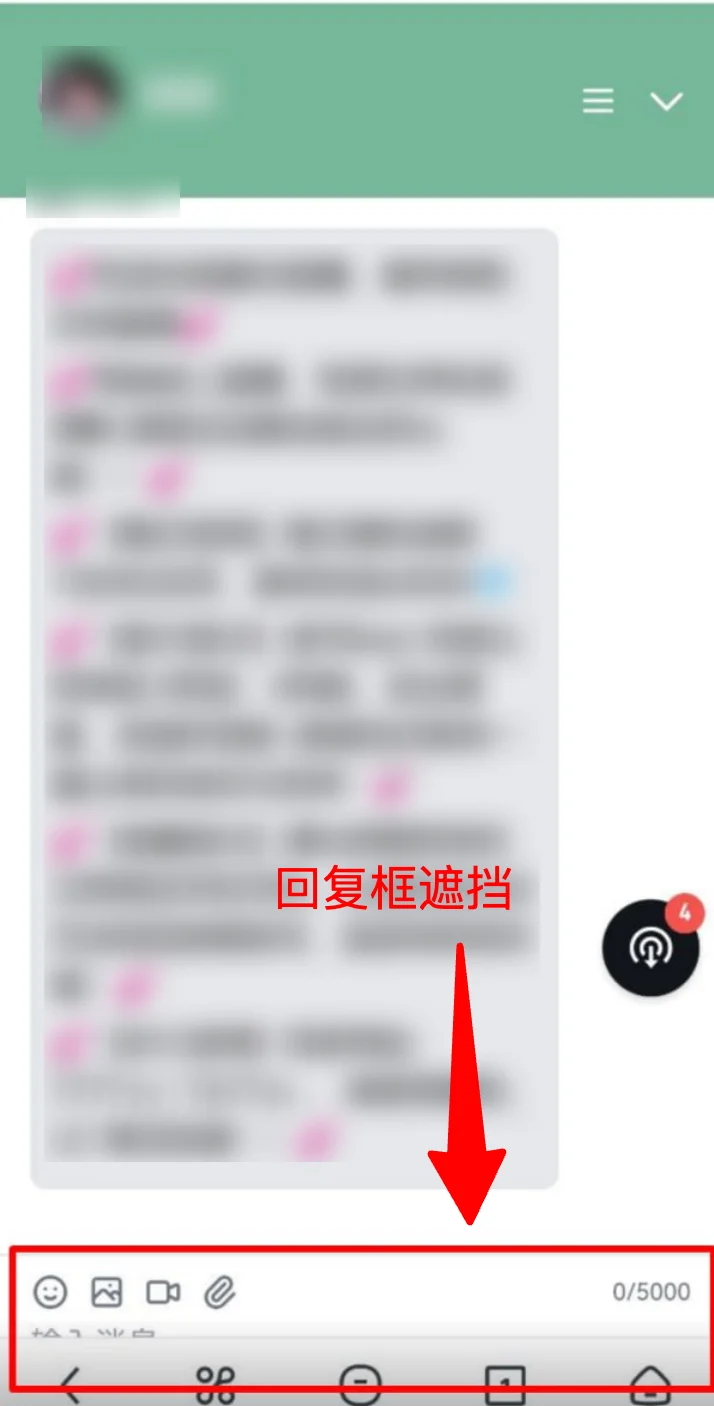
出现这种情况大概率是因为在手机浏览器中,地址栏会随滚动自动显示/隐藏,导致了页面的可视高度动态变化;而部分客户会直接用iframe把对话页直接嵌到自己的产品,设置的参数单位可能无法灵敏适配,因此导致了页面的遮挡。
解决方案(仅适用于iframe情况下):
常见的错误写法有:
/* ❌ vh 是固定值,不会随地址栏变化更新 */
iframe { height: 100vh; }
/* ❌ dvh 虽然是动态的,但老浏览器不支持 */
iframe { height: 100dvh; }
✅我们推荐的写法是:使用JavaScript 动态计算高度,兼容所有浏览器:
<!DOCTYPE html>
<html>
<head>
<meta charset="UTF-8">
<meta name="viewport" content="width=device-width, initial-scale=1.0">
<style>
body, html {
  margin: 0;
  padding: 0;
  overflow: hidden;
}
</style>
</head>
<body>

<iframe id="chat-iframe" src="您的客服页面地址"></iframe>

<script>
function resizeIframe() {
  var iframe = document.getElementById('chat-iframe');
  iframe.style.width = '100%';
  iframe.style.height = window.innerHeight + 'px';
  iframe.style.border = 'none';
  iframe.style.display = 'block';
}

resizeIframe();
window.addEventListener('resize', resizeIframe);
</script>

</body>
</html>
注意⚠️
- 必须设置 `margin: 0; padding: 0;` - 否则会出现多余的边距
- 必须设置 `overflow: hidden;` - 防止出现滚动条
- 必须设置 `display: block;` - iframe 默认是 inline 元素,会有底部间隙
- 不要用固定像素值 - 如
height: 800px;无法自适应不同设备